Introducing StoryLite ⚡️, a lightweight alternative to StoryBook
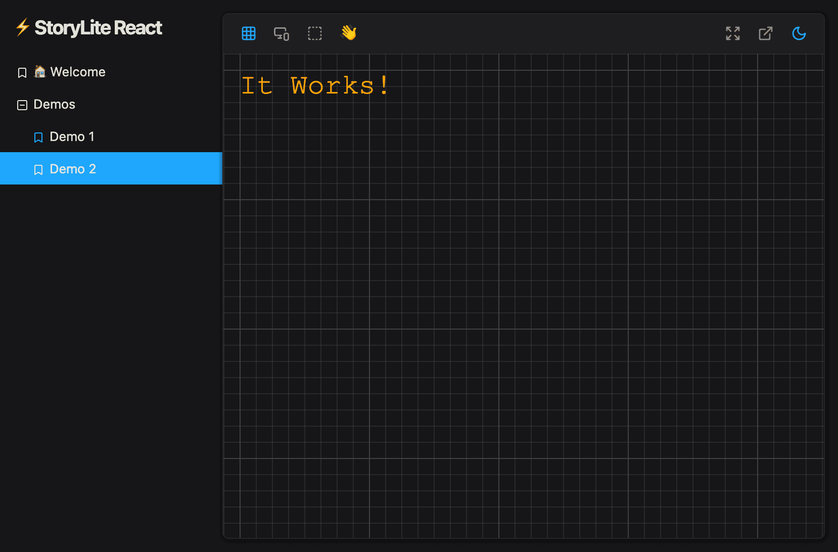
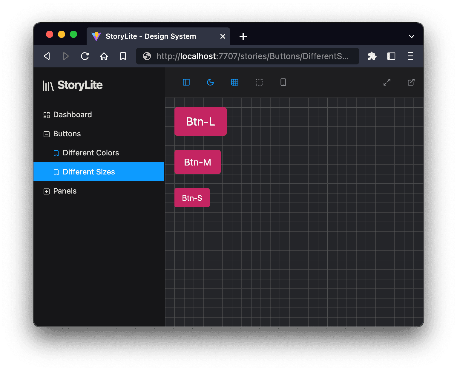
Lightweight drop-in app for rapid React component development and visualisation
Senior Full Stack Developer in the ☁️
Creator of supereffective.gg, a Pokémon community running on Next.js and @vercel
As developers we understand the importance of efficiently testing and showcasing our components, that's why some months ago I embarked on a journey to create StoryLite, a lightweight (~36KB) and user-friendly alternative to Storybook, with built-in support for Component Story Format v3 (CSF), the open standard to write stories.
Written in TypeScript and powered by the blazing-fast Vite, StoryLite offers a streamlined way to preview your components in an isolated environment without the overhead of a full-fledged Storybook setup.
You only need to configure a Vite server with the StoryLite plugin, instantiate the StoryLite React app and voilà!
Thanks to the power of Vite, StoryLite also supports Static-Site generation (SSG) out of the box!
Inception and Motivation
The idea for StoryLite sprouted from a simple need: to have a quick and hassle-free way of visually testing my React components during development. While Storybook is an incredible tool, its complexity and setup sometimes felt like overkill for smaller projects or when a rapid iteration cycle was crucial. I wanted a solution that would provide a similar experience but without the configuration overhead. StoryBook has also a lot of package dependencies.
Getting Started with StoryLite
Getting StoryLite up and running in your React project is a breeze. With a few simple steps, you can start previewing your components in isolation from your full app:
Installation: You can install StoryLite with the package manager of your choice, with one of the following commands:
 # npm
 npm i -D @storylite/storylite

 # yarn
 yarn add -D @storylite/storylite

 #pnpm
 pnpm add -D @storylite/storylite
Install Vite: Install Vite and the React plugins (if you don't have these dependencies already in your project).
 # npm
 npm i -D vite @storylite/vite-plugin @vitejs/plugin-react-swc

 # yarn
 yarn add -D vite @storylite/vite-plugin @vitejs/plugin-react-swc

 #pnpm
 pnpm add -D vite @storylite/vite-plugin @vitejs/plugin-react-swc
Configure Vite: Create a
vite.config.tsfile at the root of your project. This is where you can tell Vite and the StoryLite plugin where to find your stories. Here's a basic example:/// <reference types="vite/client" /> import storylitePlugin from '@storylite/vite-plugin' import react from '@vitejs/plugin-react-swc' import { defineConfig } from 'vite' export default defineConfig({ plugins: [ storylitePlugin({ stories: 'stories/**/*.stories.tsx', // relative to process.cwd() }), react(), ], })Configure typescript: You need a couple of changes in your
tsconfig.jsonfor TypeScript to detect the types correctly, especially the stories collected by the Vite plugin at run-time. Merge the following with your own config:{ "include": ["src", "stories", "storylite.tsx"], "compilerOptions": { "types": ["@storylite/vite-plugin/virtual"] } }Add the entry points: Create
index.tsxandindex.htmlin your project (or somewhere else) with the content you can find in this demo (you can customize it to your needs): https://stackblitz.com/edit/storylite-demo?file=src%2Findex.tsx,index.htmlThe StoryLiteApp component is a full-screen React Single-Page app (it uses a hash-based router), and it can be mounted anywhere you wish.
If you already have a Vite project or an
index.htmlfile in the root of your project, it's recommended that you setup StoryLite in a new package (if you are in a mono-repo) or in another directory.Remember that you also need
reactandreact-domas dependencies.Run StoryLite: Launch the StoryLite development server using Vite's lightning-fast build system. For that, we can add two simple scripts to our
package.json:{ "scripts": { "stories:build": "vite build", "stories:dev": "vite --port=7007 --host=0.0.0.0 --open" } }Then, run
npm run stories:dev,yarn run stories:dev
orpnpm stories:devPreview Your Components: Visit
http://localhost:7007in your browser to explore your component stories. You can also use any other port in your script.Generate a static version: When you run
stories:build, you will be generating a static version (SPA) of your StoryLite instance, with your stories. That's useful if you want to host it somewhere, like in your Github Pages.
All these examples are compatible with StoryLite >=0.9.* at the time of writing this article.
You can check the example code in the repository as well: https://github.com/itsjavi/storylite/tree/main/packages/examples/react
The Current State: Version 0.9.0
As of now, StoryLite has reached version 0.9.0. While it may not yet offer the full spectrum of customization options that Storybook boasts, it certainly provides the essentials to get you started on the right foot. With this version, you can effortlessly create and visualize your component stories, making development and debugging a smoother experience.
Porting your stories from StoryBook won't be much of a problem, since StoryLite is almost fully compatible with CSF 3.0.
Current Limitations
Only compatible with React (for now)
No support for StoryBook features like "auto docs", "code snippets", "knobs", "controls", "actions" or "events"
No support for MD/MDX files (yet)
Styles are not mounted/unmounted per component, they can only be global at the moment (loaded by your entry point).
While it would be nice to support a wide variety of tools, we want to keep things as simple as possible.
What's Next for StoryLite
The journey of StoryLite has just begun, and there's a lot to look forward to in upcoming releases.
CSF: My plans include finishing the story definition API to close the final gaps with the StoryBook's CSF 3.0 spec and StoryBook's compatibility, ensuring a seamless migration process for those transitioning.
Props editor: The Controls panel (where we can adjust the props) is also a must-have and will come in the next versions.
Test runner: My dream is to bring component testing to the browser, by using Jest and maybe React Testing Library. I would like to facilitate this via the CSF's play() function.
Finally, I would also like to rework the Addons and the Addons API, so you could bring your own and fully customize the toolbars, in a similar approach to StoryBook's.
Join the StoryLite project
StoryLite is a project fuelled by the developer community. Your feedback, suggestions, and contributions are invaluable in shaping the future of this tool.
Whether you have ideas for new features, encounter bugs, or simply want to share your success stories, I encourage you to join the discussion and development process on GitHub: github.com/itsjavi/storylite.
While the scope of this library is to support React components (and probably RSC), you are welcome to contribute to adding support for other frameworks and environments.
Final Thoughts
In conclusion, StoryLite is here to simplify and streamline your component testing workflow. If you're looking for a lightweight, TypeScript-powered alternative to Storybook, give StoryLite a try.
Happy coding!